Case Studies
MEGABUS
UX/UI DESIGN + USER TESTING
Design iterations of the Megabus website determined by a user test conducted to improve usability of the interface and booking process.
TOOLS:


ROLE(S):
Lead Researcher, UX/UI Designer - Ashley Huszti
Test Participants - Ya Dang, Justin Obra, David Crean, Nate Davis, Elyse Francis
June 2022
DURATION:
OVERVIEW
Megabus is a major North American transportation bus serving 100 cities between the US and Canada, known for their affordability and convenience to a wide demographic of people. The objective of this user test was to determine design inconsistencies and usability problems within the content areas, and booking areas. This exercise collected data under controlled test conditions to establish baseline user performance and satisfaction of the interface for future usability evaluations.
PROBLEM
Upon my initial audit of the website it was clear that there were some dated design practices throughout the interface. In my research for the font, I was able to determine the Brand Guide for Megabus had not been updated since 2013. Potential sources of error in the objective of the user testing included:
Visibility – failure to locate functions, excessive clicks to complete a task, failure to follow recommended screen flow.
Consistency – failure to locate and properly act upon desired information, selection errors due to labeling ambiguities.
Error Prevention – improper labelling or entry field usage.
RESULTS
The Usability Test Report was created at the conclusion of the usability test, and used to create an updated Megabus prototype with improved user flow.
It consists of a report of the results including…
Evaluating the usability metrics against the pre-approved goals
Subjective evaluations
Specific usability problems and recommendations for resolution.
The recommendations were then categorically sized and strategically implemented to create a prototype of a redesigned website that reduced the rate of both critical and non-critical errors.
USER TESTING
The user testing was conducted with participants over Zoom, and recorded to document the findings. While recording I was also taking notes on the responses from participants, timing for tasks, and noting any feedback. I used these recordings to then verify the findings and determine my conclusions.
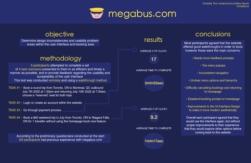
Usability Test Report
A visual showcase of the testing objective, method, results and conclusions
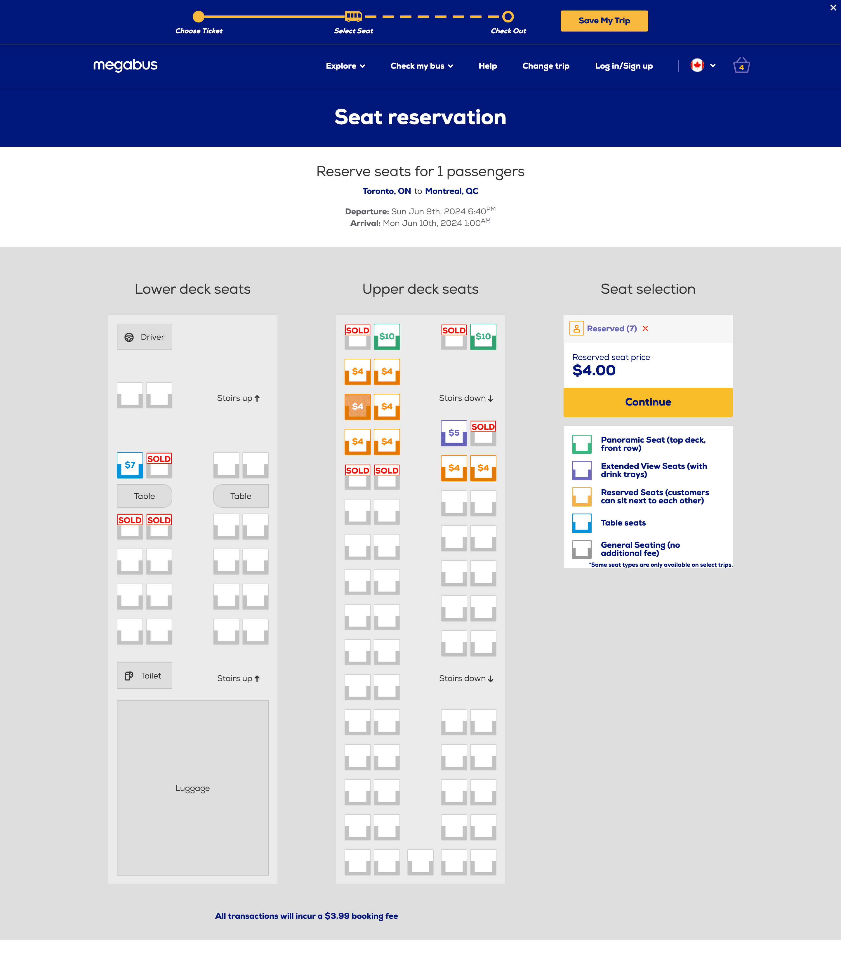
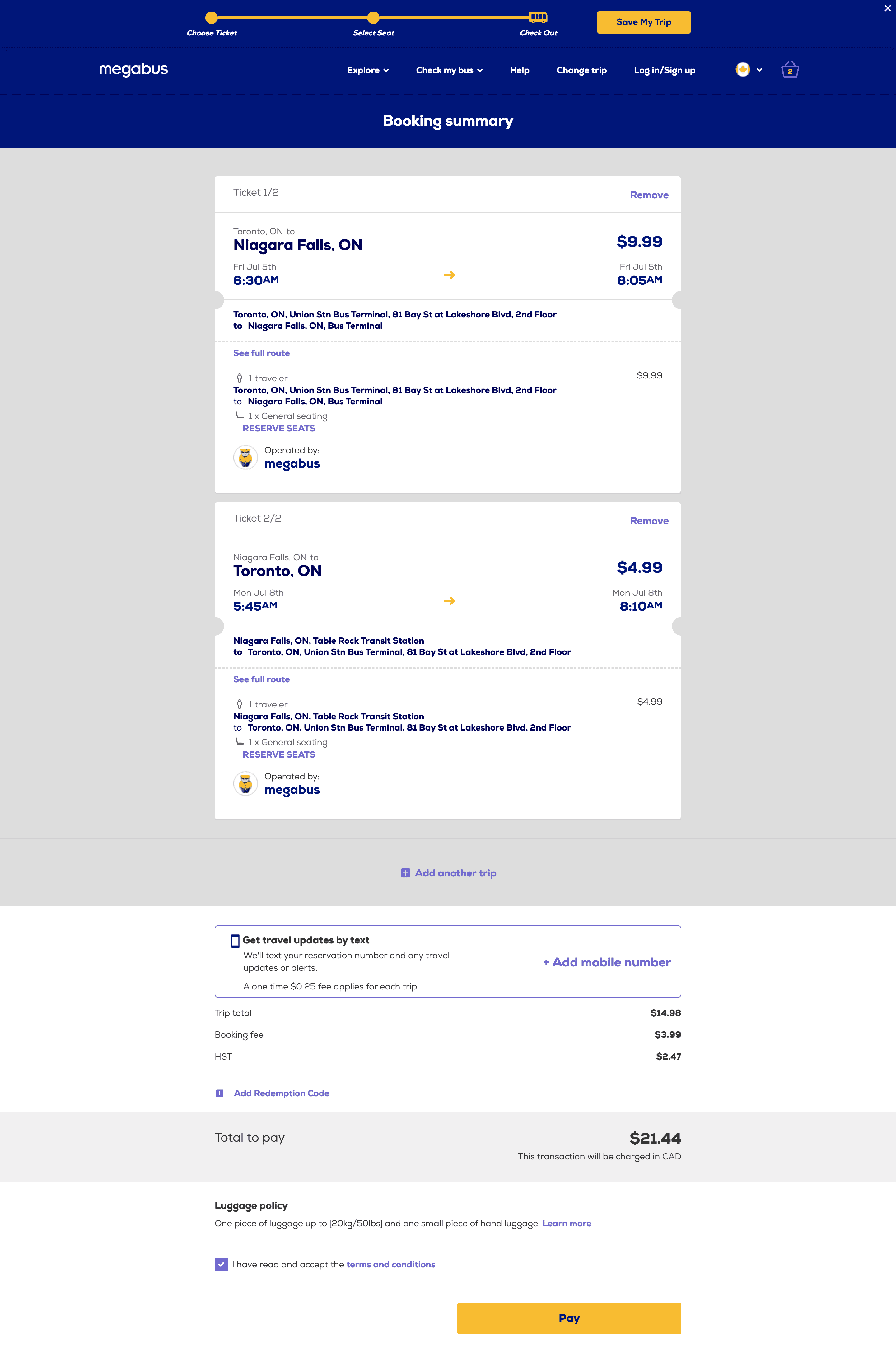
DESIGN PROCESS
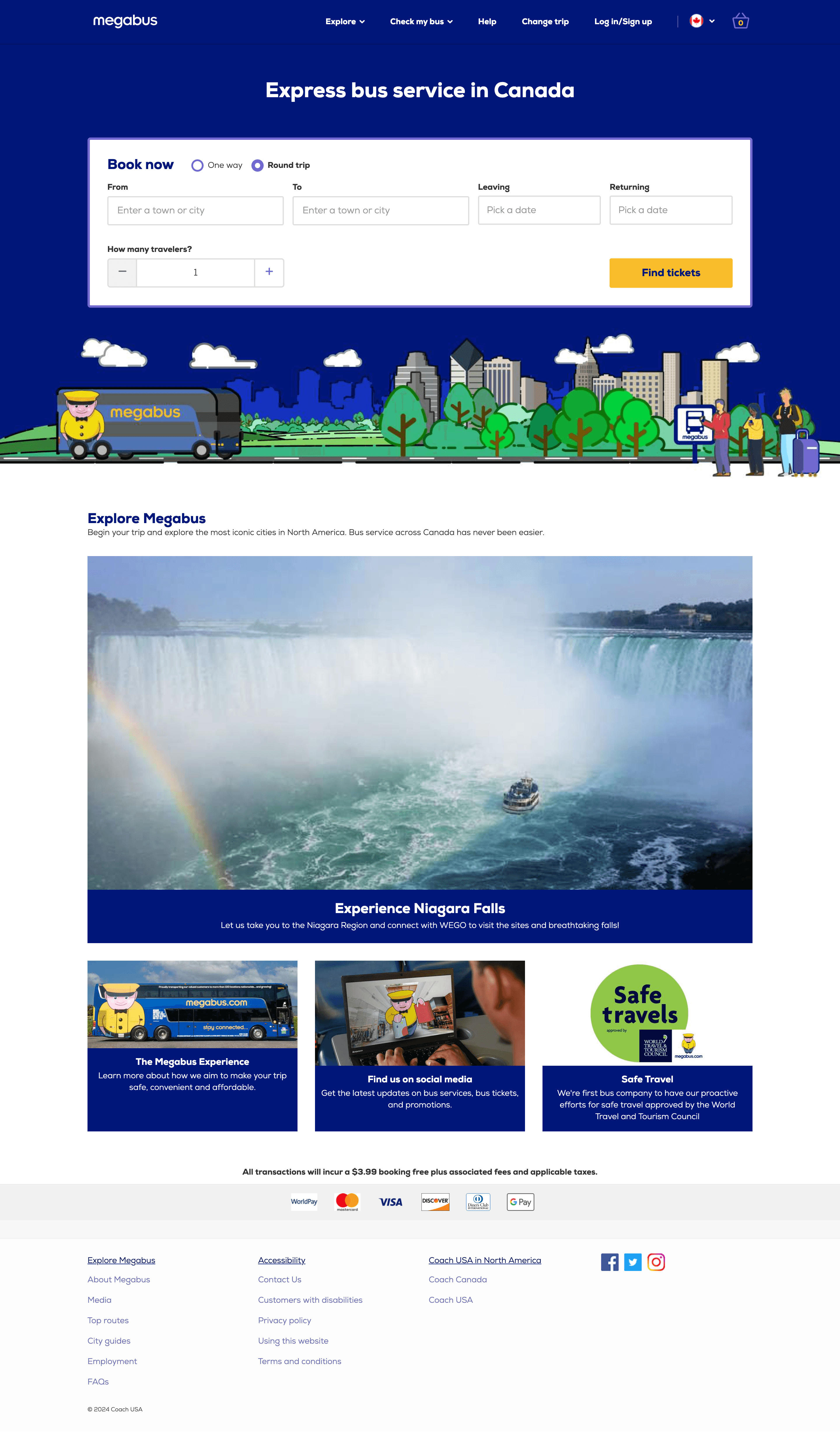
website audit
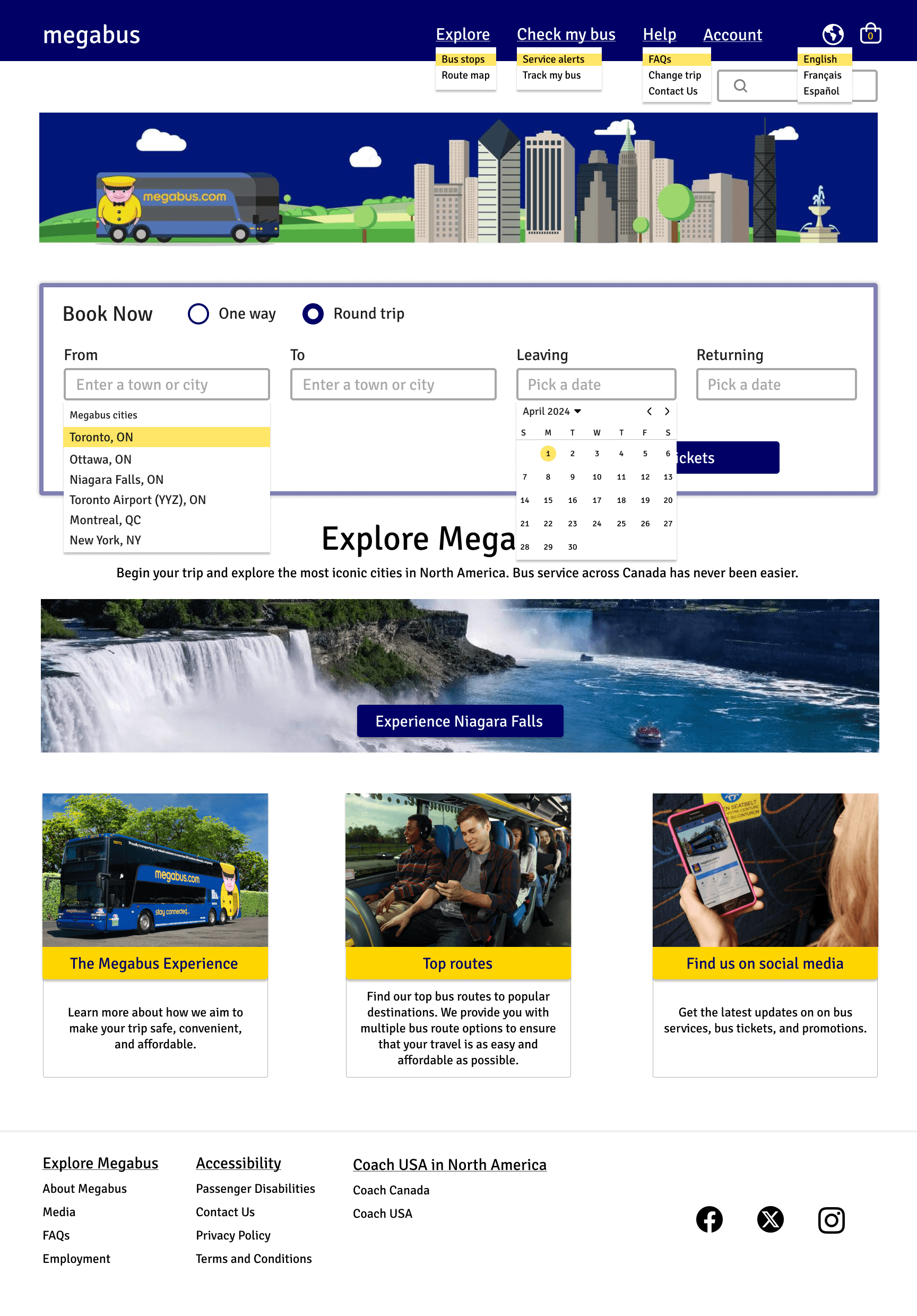
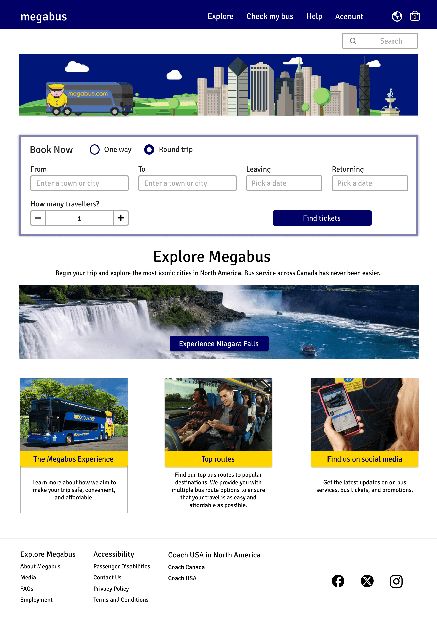
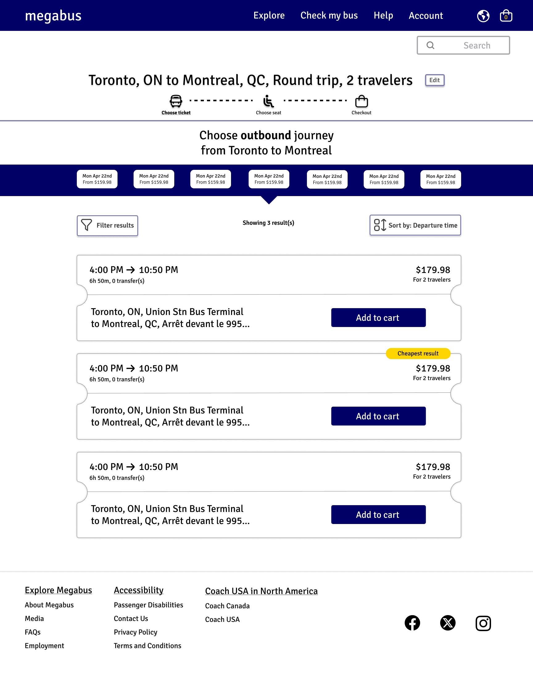
With the redesign I decided to keep the overall design of the website true to their current branding, while still improving the key factors revealed with the user testing. Here I've displayed an example of some stand-out concerns within the original Homepage.
1
2
3
4
5
6
8
9
7
1
2
3
4
5
6
7
8
9
"Fare Finder" under options is not useful
"Help" could be a dropdown menu
"Change Trip" can be moved to "Help" menu
"Log in/Sign up" can be renamed for clarity
Maps can be changed to recognized language
icon for clarity
"Experience Niagara Falls" is a dead-end and has no option to book a trip within.
Cards are dated in appearance
Card content could be more useful content
"Top Routes" can be in FAQ's and/or a card above
Social Media icons can be updated to standard
Accessibility options are redundant and can be
condensed and renamed for clarity
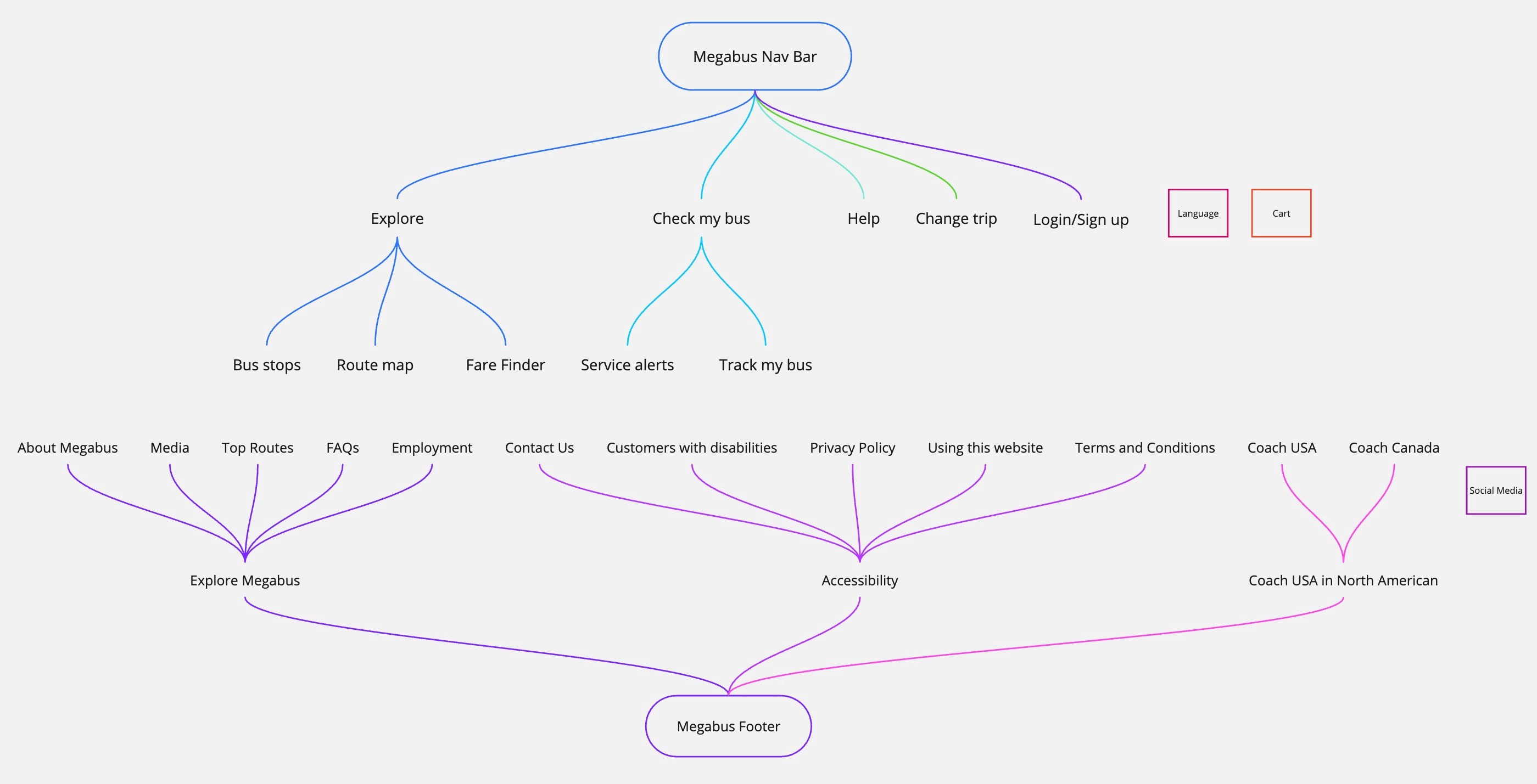
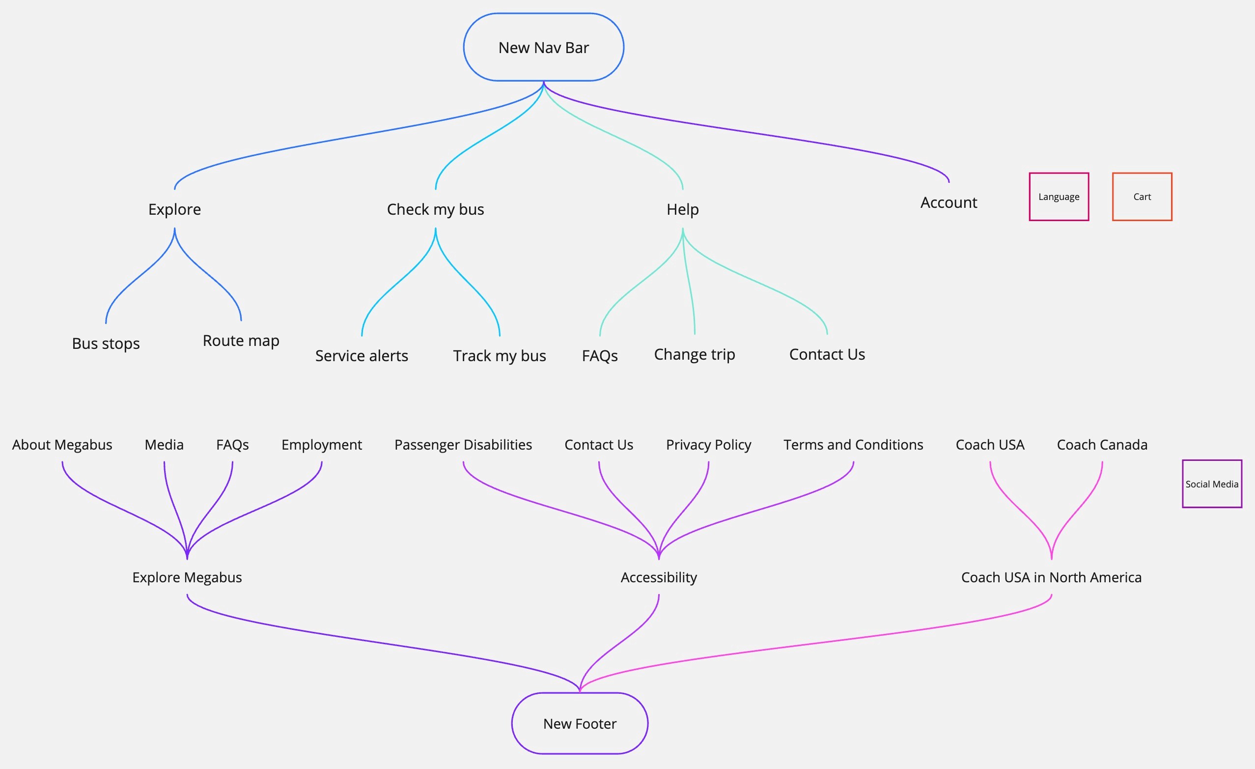
Information Architecture
I started in Miro to address the first large issue with the user flow to create a new navigation and footer to condense and clarify each category. An unclear navigation bar creates an overload of calls to action and reduces the findability of the page that they're trying to access.
Wireframing
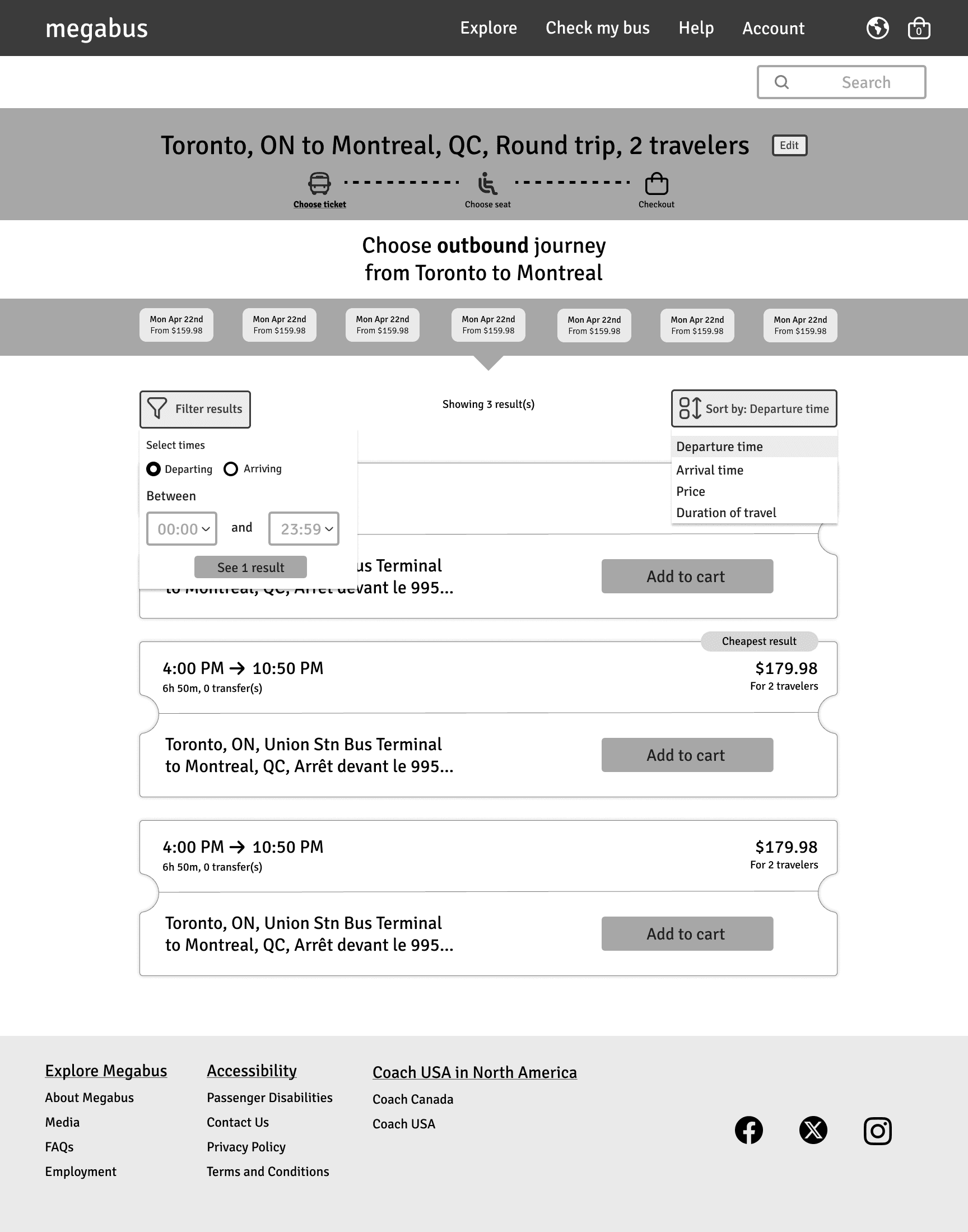
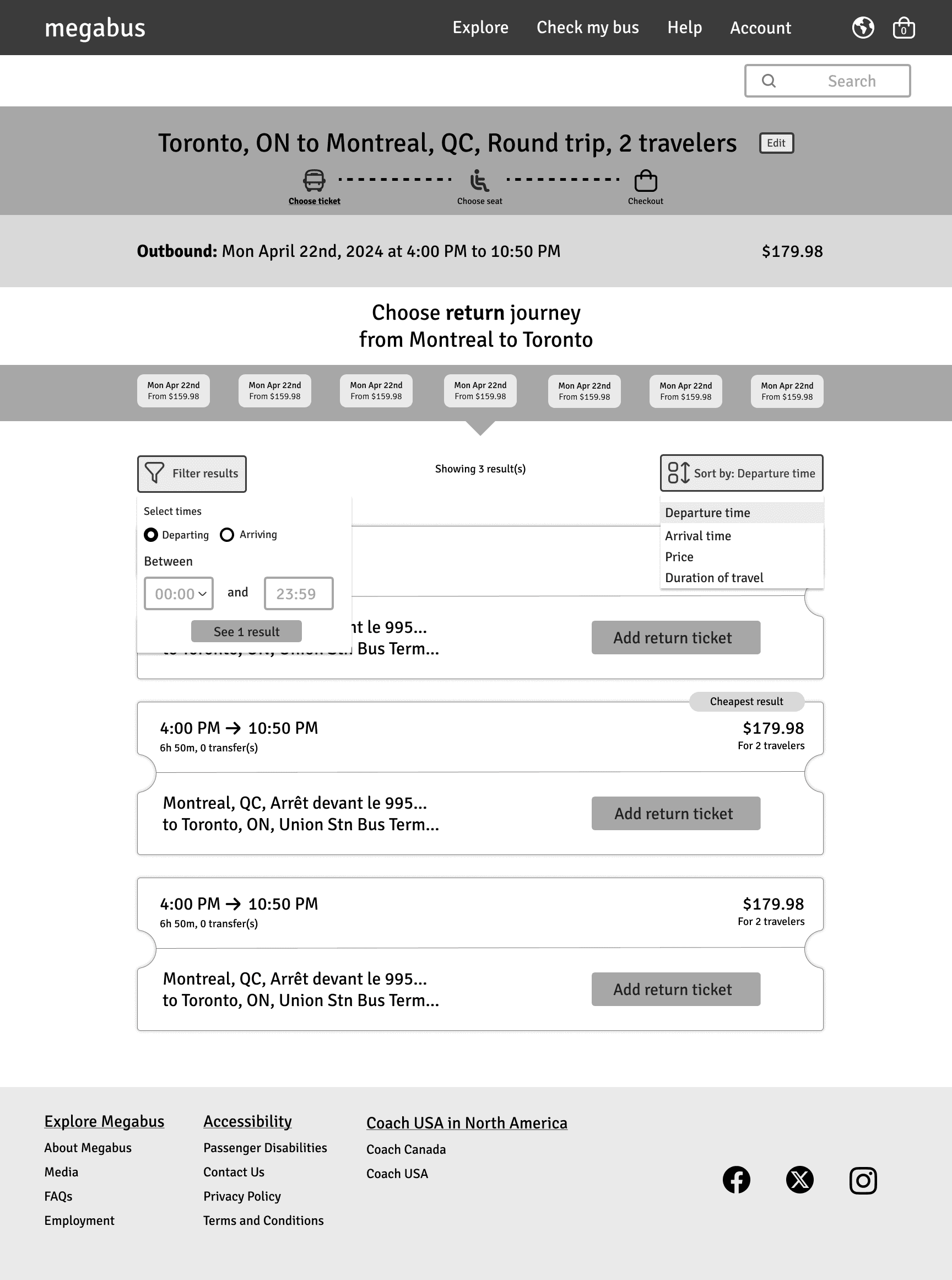
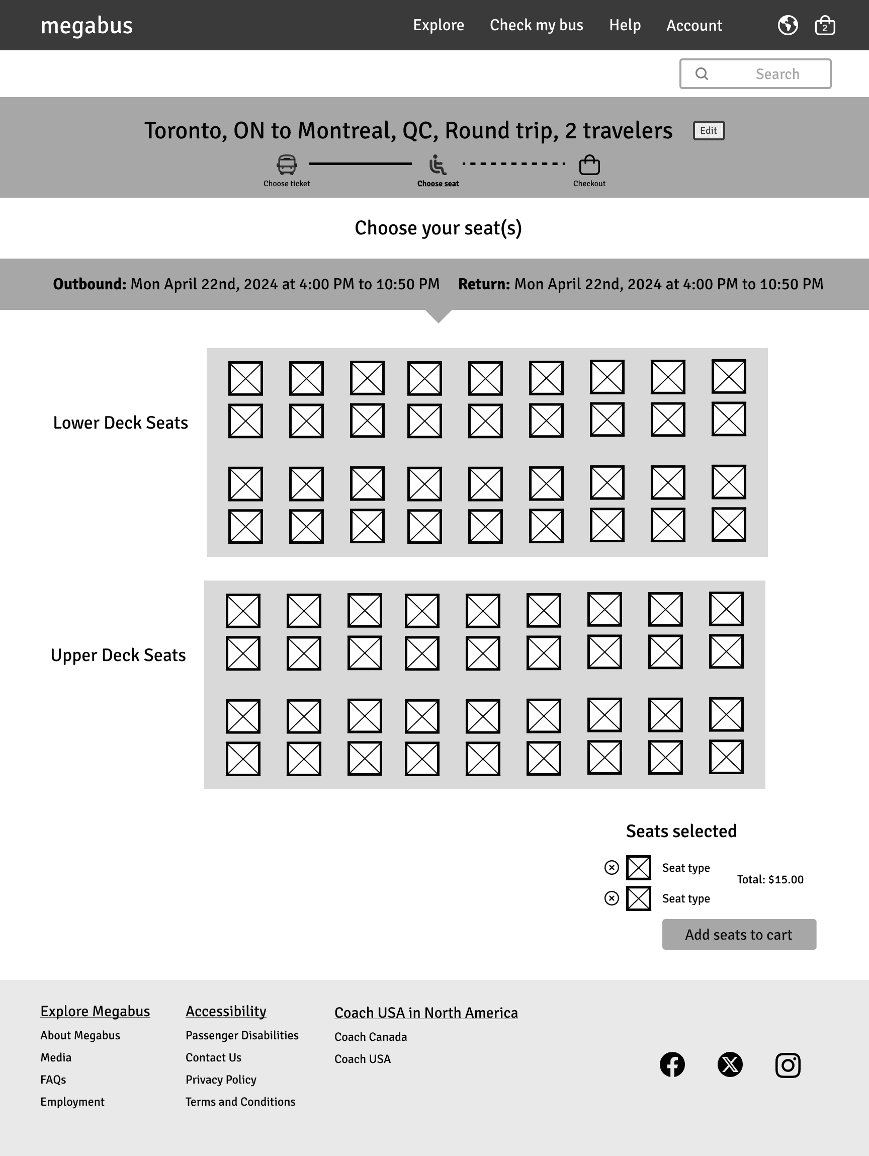
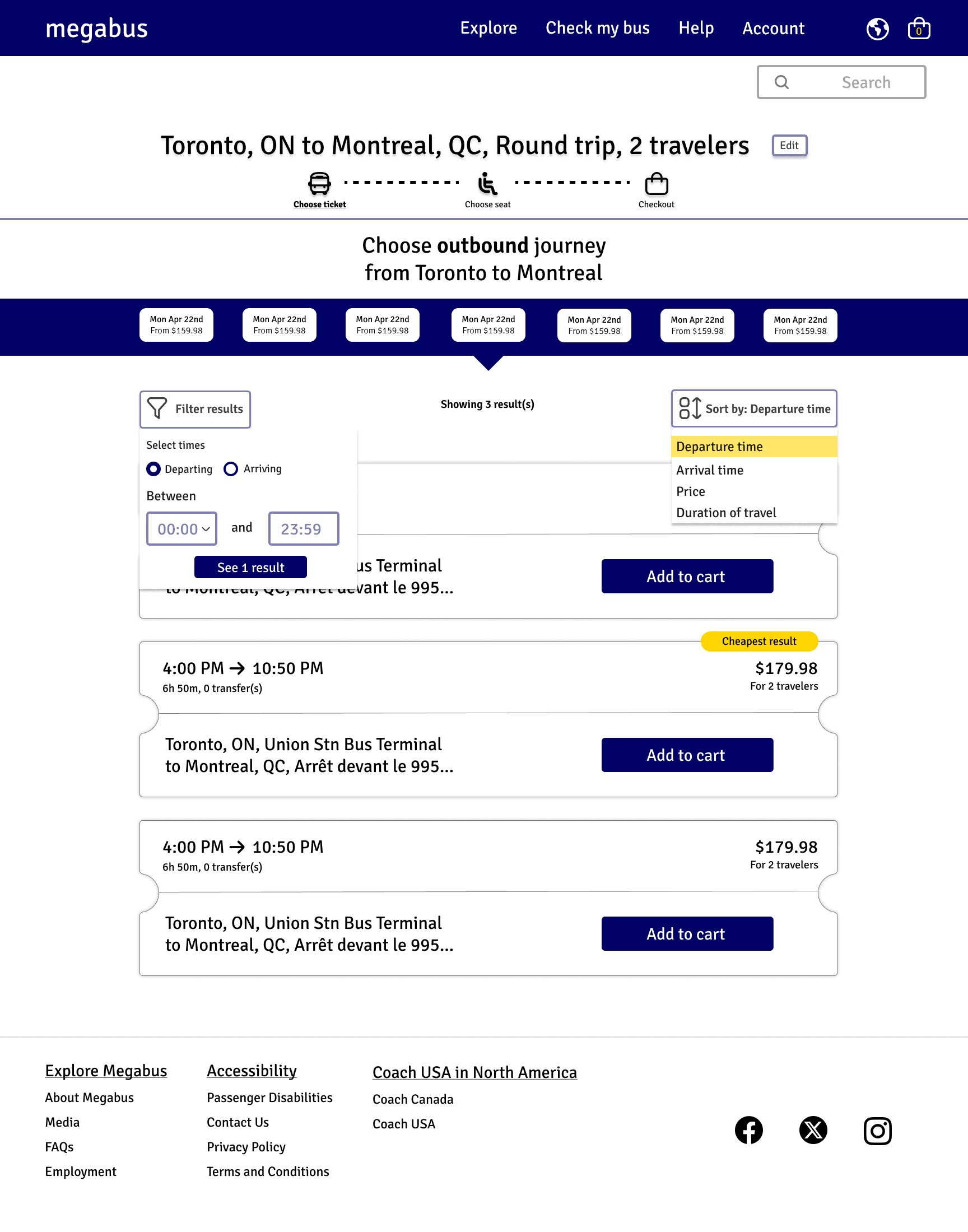
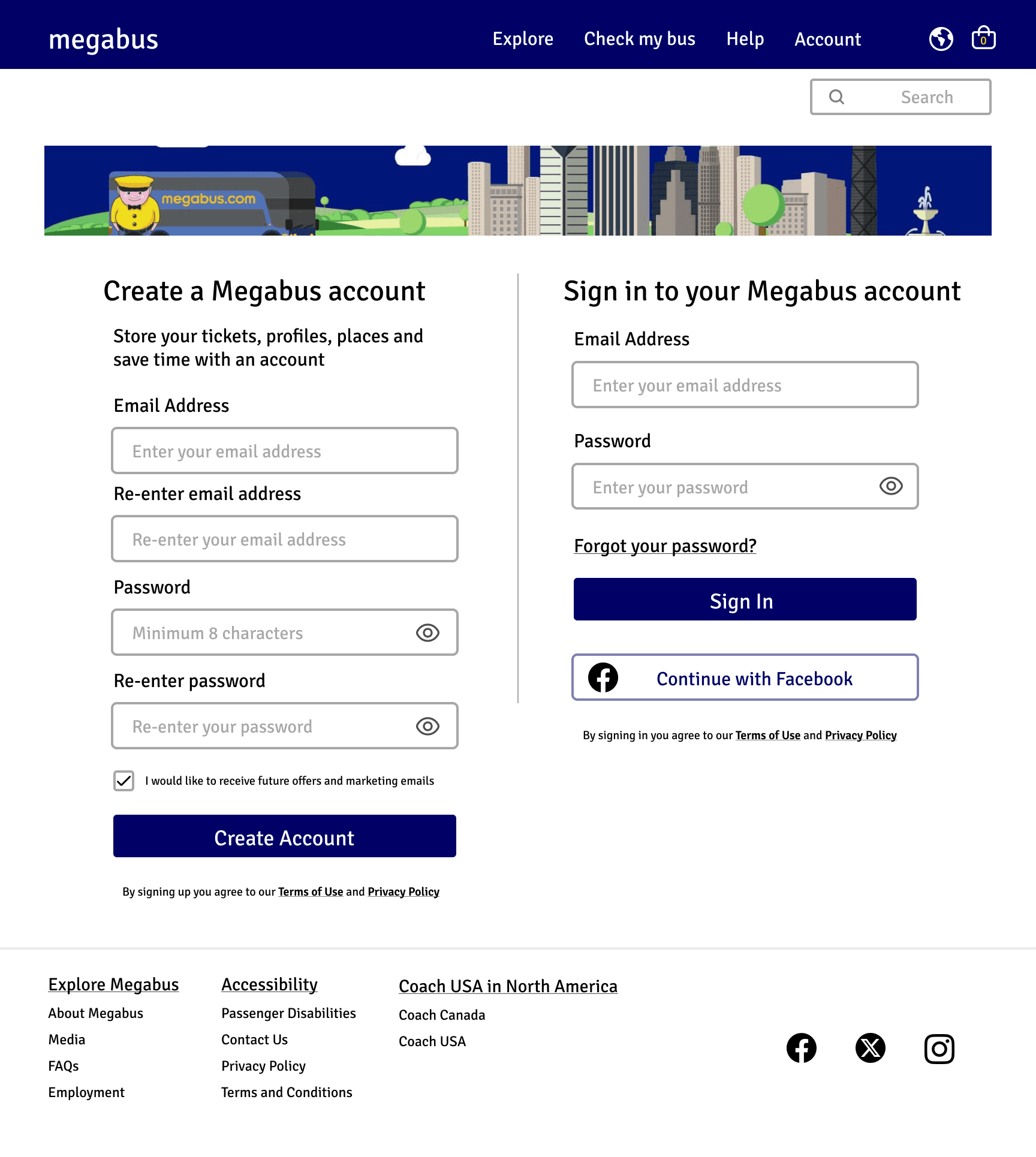
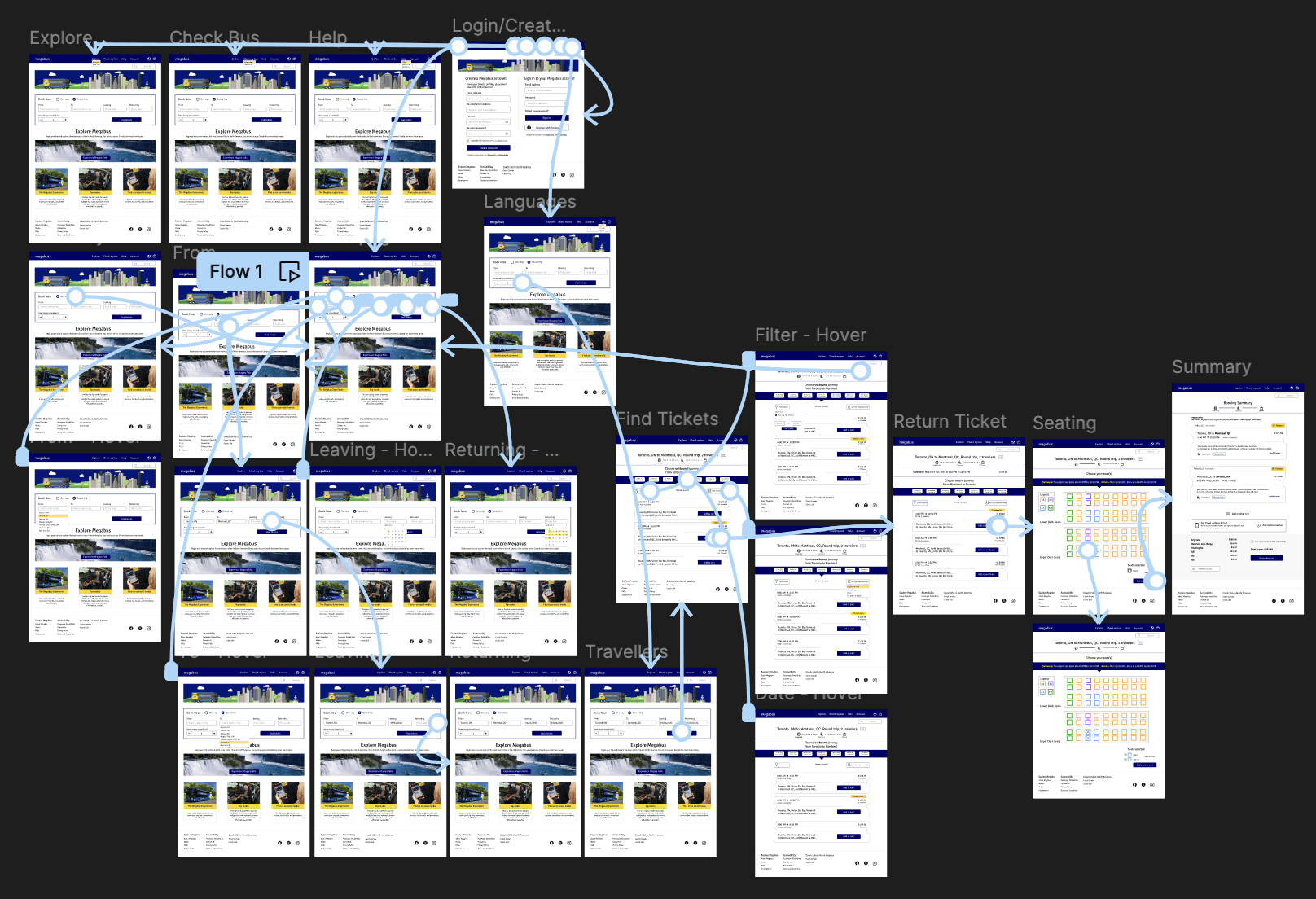
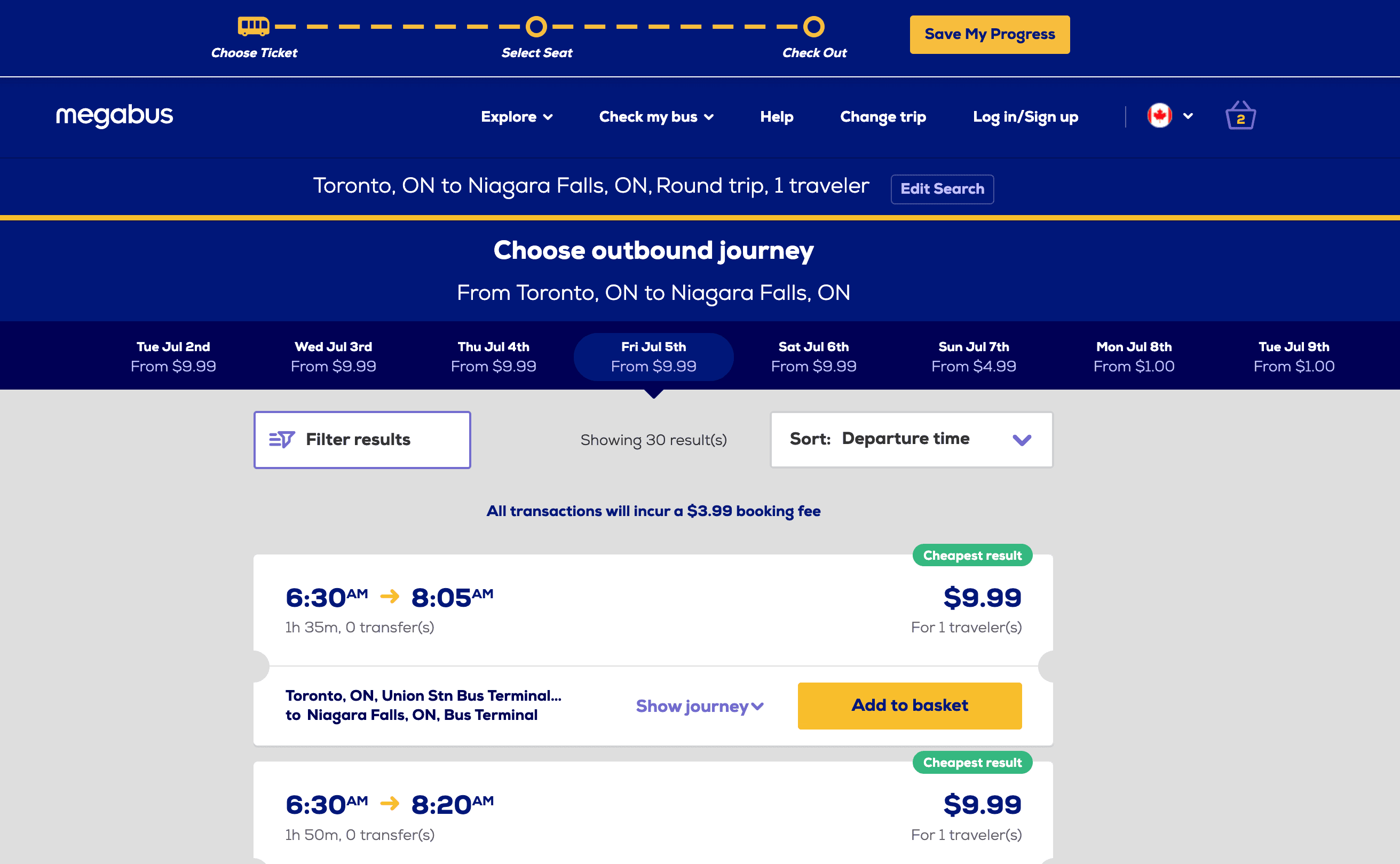
From Miro I moved on to Figma where I took the information architecture and built out a lo-fi wireframe that transformed the current Megabus website to an improved and consistent user flow, feeling more refreshed and approachable for users while still remaining on brand.
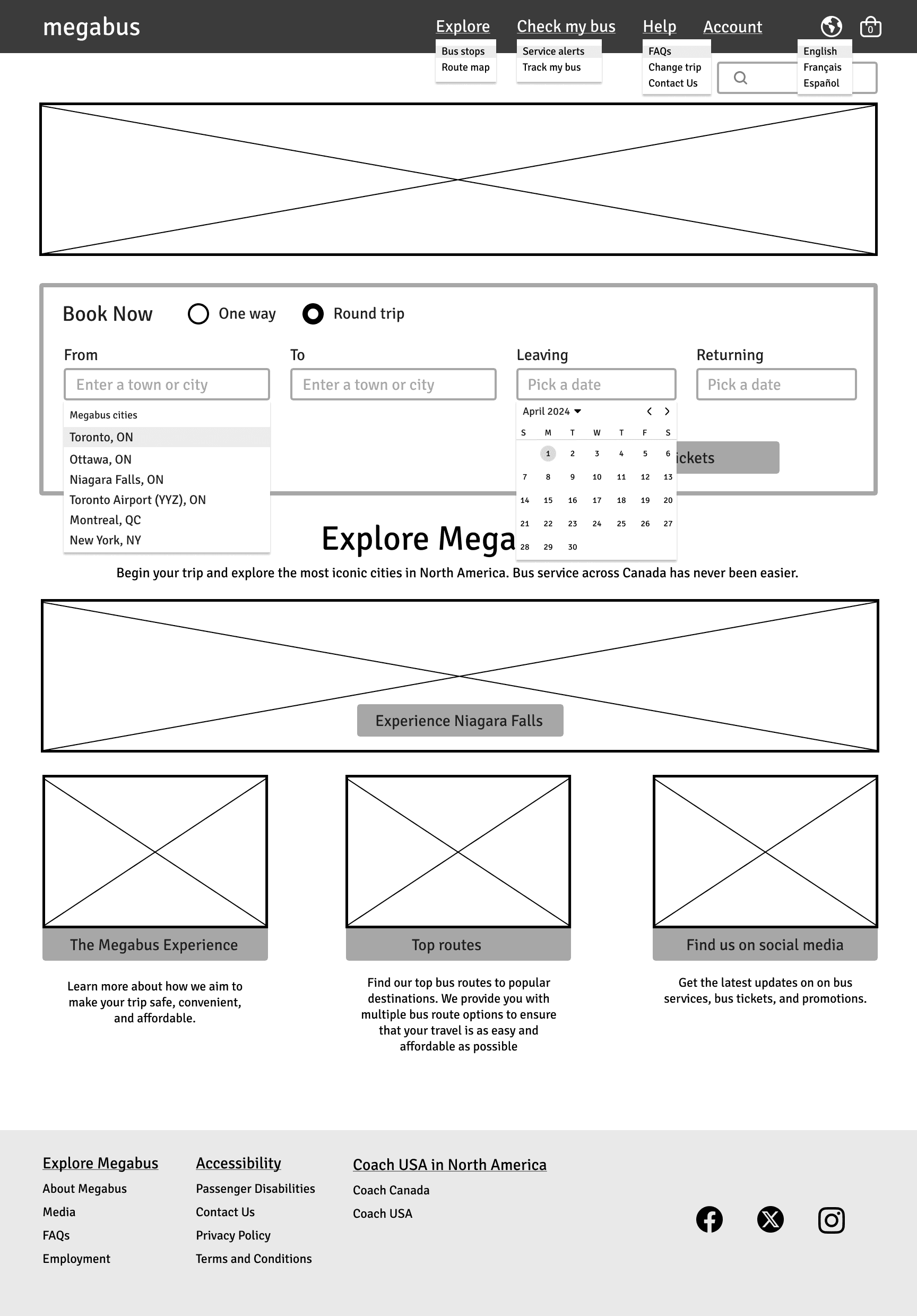
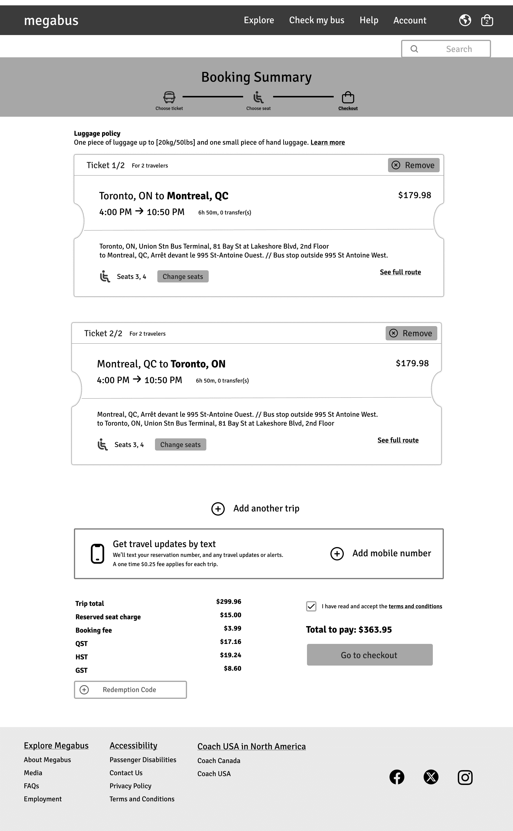
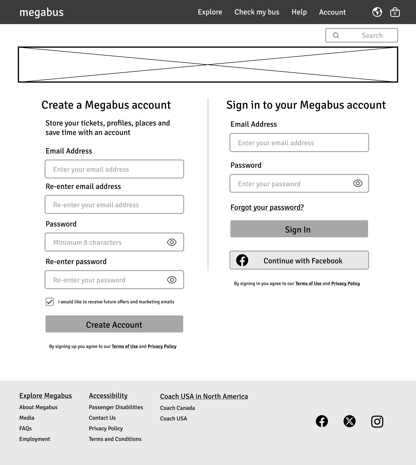
The high fidelity wireframes took the Megabus brand colours from the official Brand Guide and used them to add contrast to the homepage, emphasizing the calls to action that would be important for the user to improve findability and clarity.
Prototyping
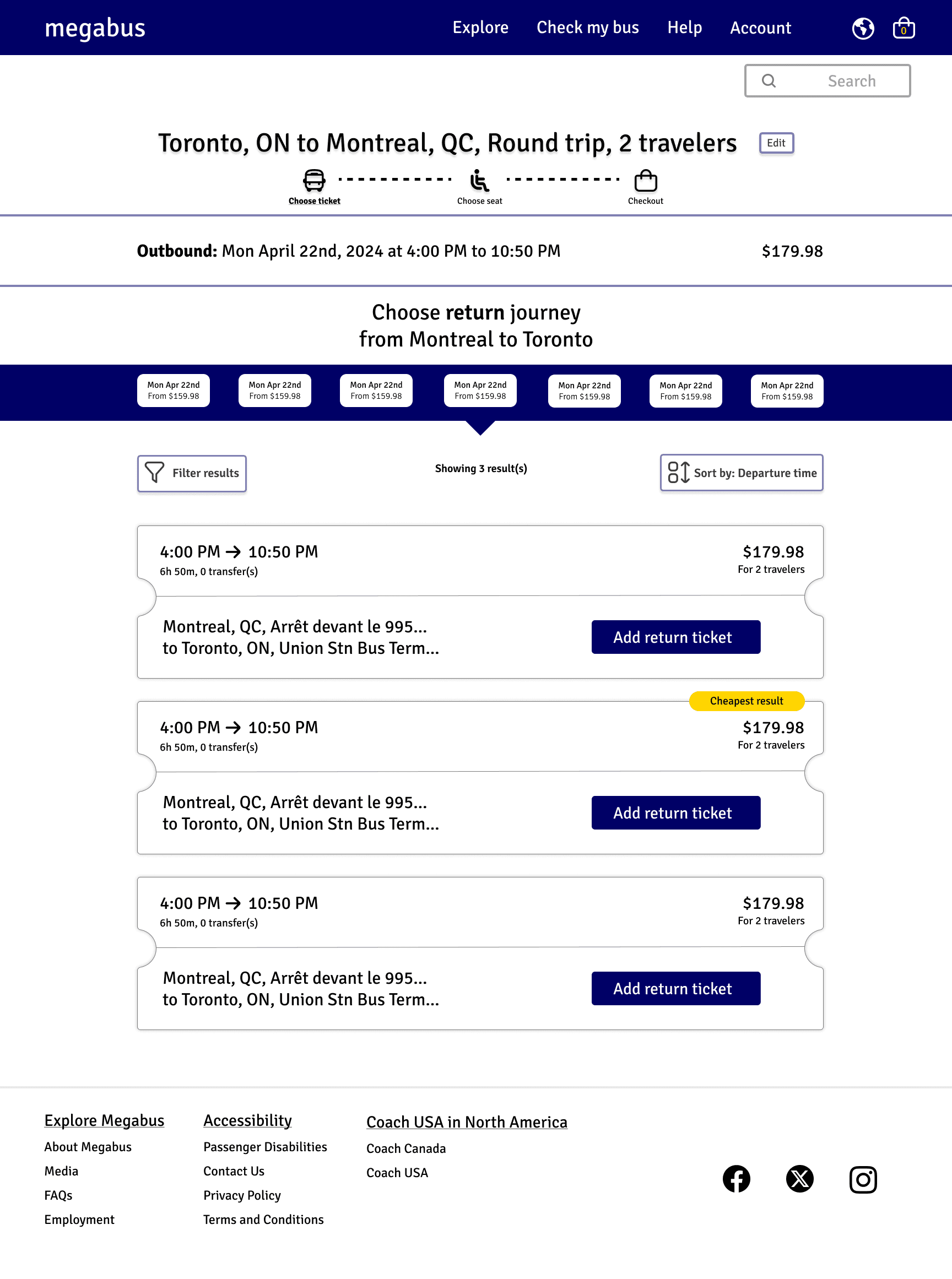
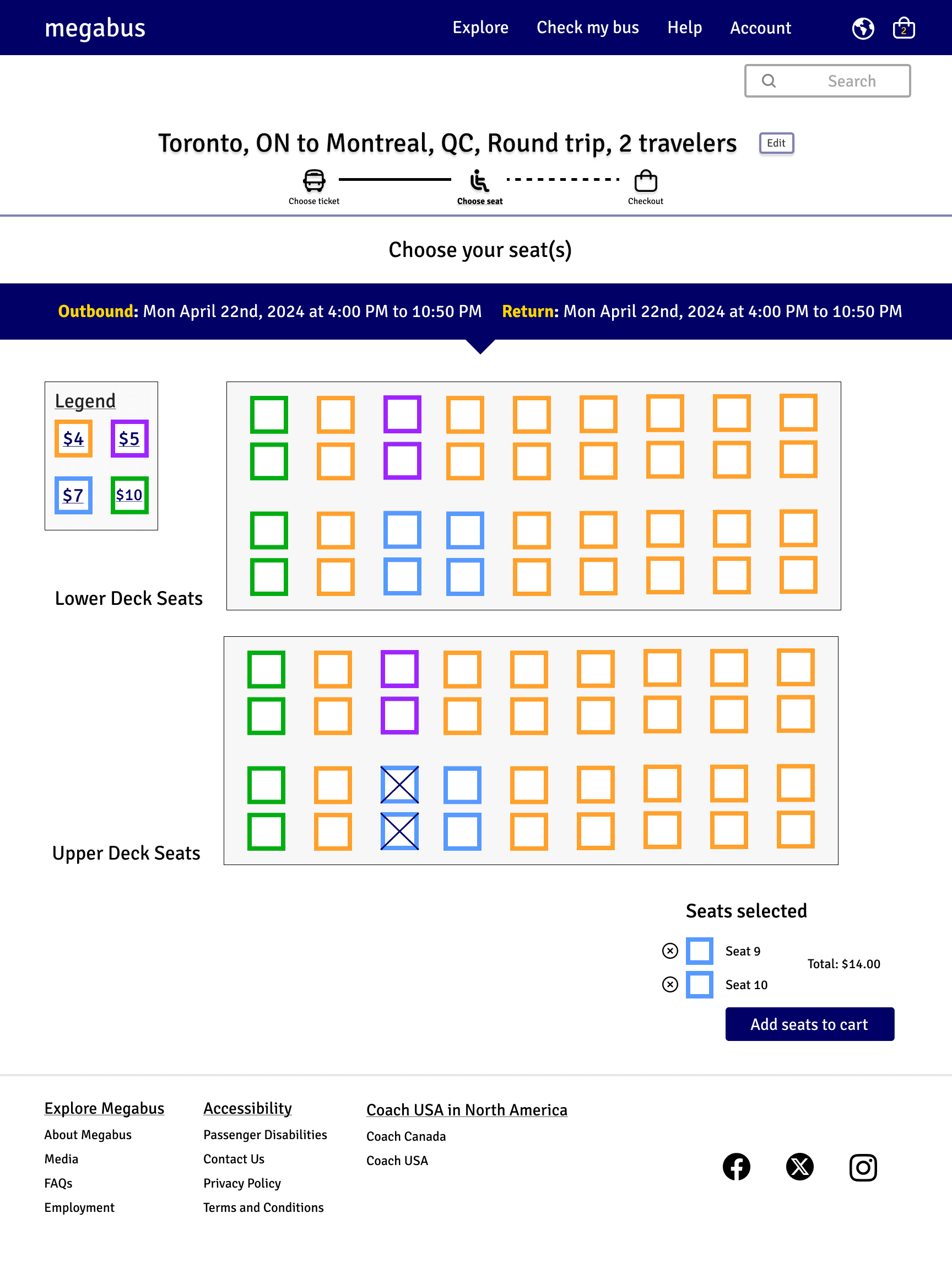
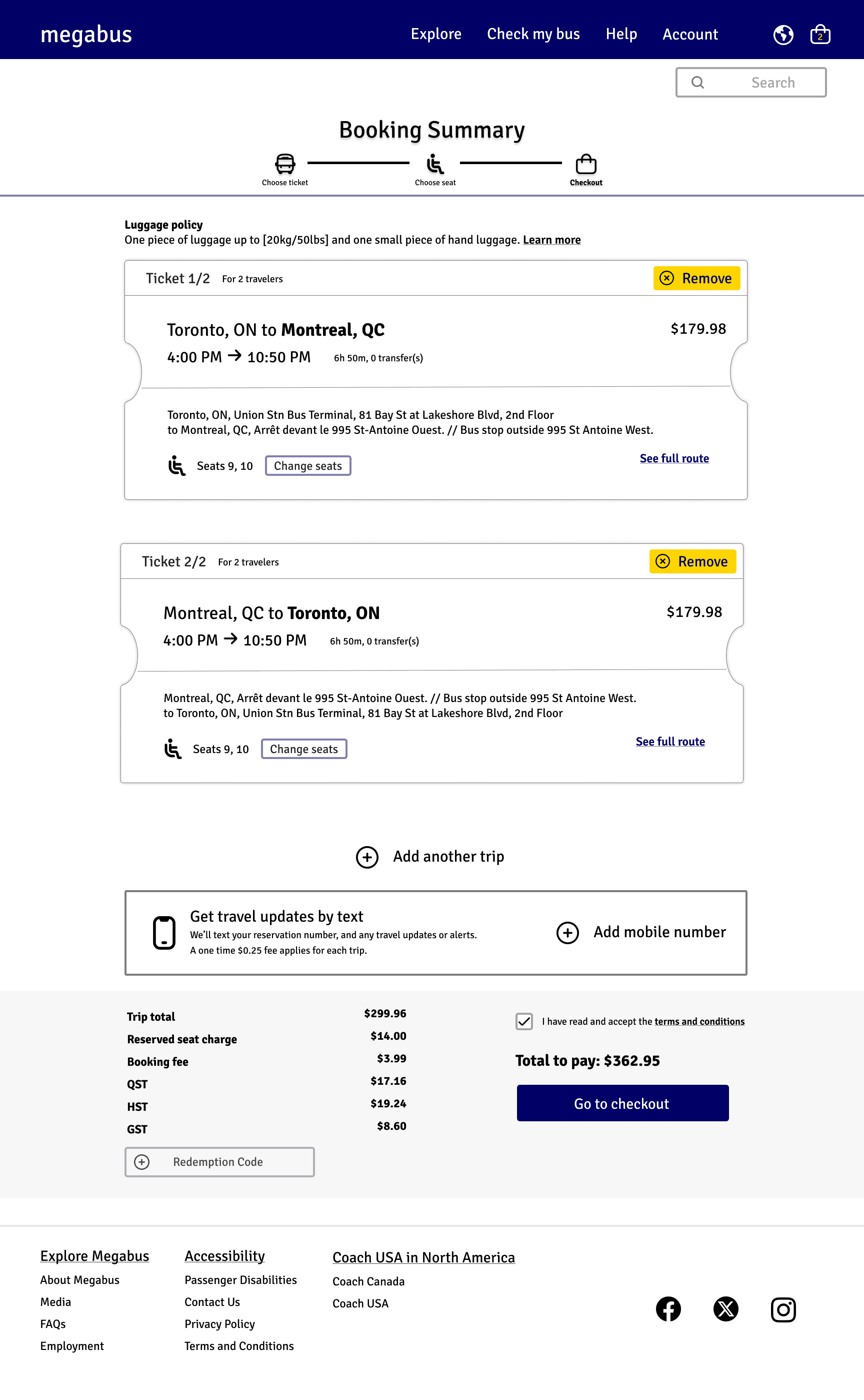
The high-fidelity wireframes were created into a functional Figma prototype to aid the visualization of how the redesign would function. This prototype showcases the most highly used assets of the website progressing through landing on the homepage, and into the main functions of the booking process.
usability comparisons
When comparing the current website, to the redesigned prototype, it addresses:
Remaining recognizable to frequent users
Reduced errors and cognitive overload
Improved consistency and feedback
Decreased average task completion time
LEARNING & TAKEAWAYS
This project was my first time leading a user test, and the first time that I lead an end to end process from the UX research to designing and creating a prototype. I enjoyed creating and leading the user test most out of this process. It created a solid foundation to build from throughout with informed design choices.
CHALLENGES:
For the redesign I found myself wanting to stray and create my own branding. My approach remained user focused to keep the new design on brand as they have created a recognizable look and feel to their overall experience. I took the aspects that I liked and functionally improved the user experience but not overwhelming loyal users.
TAKEAWAYS:
If I were to revisit this project I would do a second round of user testing to get feedback and potential iterations of the redesign. To challenge myself further I would also like to incorporate a rebranding aspect. Though Megabus has a loyal user it proves to benefit from some care into the initial experience of the booking process.